My role
Product Re-Design, content strategy, UI Design
Blue Cross Blue Shield - Client
Blue Cross Blue Shield - Client


The Problem
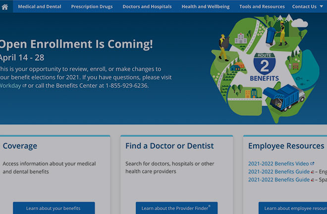
Blue Cross Blue Shield wanted to modernize its existing site and migrate over to an Adobe AEM platform, in the process, giving the user experience a consistent and seamless look consolidating pages with relevant information, and reducing user pain points.
In addition, many of the pages had an outdated look and did not fit the new modern design standards that the company wanted
Tools Used
Sketch, Illustrator, Invision, Photoshop, InVision, OptimalSort, Verify, Usability Hub, smart sheets
My Role
I created mockups of existing pages using the Sketch application with the design foundation, Fiber. I worked with Insurance business stakeholders to create user flows for the final product. Would now function as a progressive web application. Because this redesign is based on an existing product, I reviewed the requirements and focused on users' needs for:
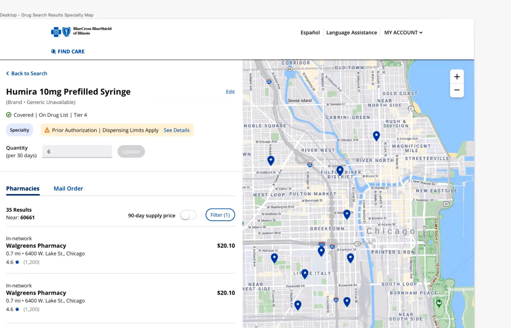
• Worked on the Provider Finder map view and updated information within the production site (Adobe AEM)
• Conducted Stakeholder research to eliminate redundant information workflows
• Conducted research to simplify navigation and user flows
• Created mobile views from desktop mockups.
The Challenges:
UX Strategy
The primary challenge of the BCBS overhaul was the sheer scope of the project, pages were numerous, and user focus groups had identified many areas of the site that had access pain points and were challenging to find. Form pages were long and required solutions. HEPA laws required that certain information was sensitive and required restricted access.
I streamlined pages and design criteria by creating web flows that simplified the user journey. Working with business stakeholders helped me understand the project scope and how to narrow my research focus, ensuring brand and stakeholders have input into the design process.
Development:
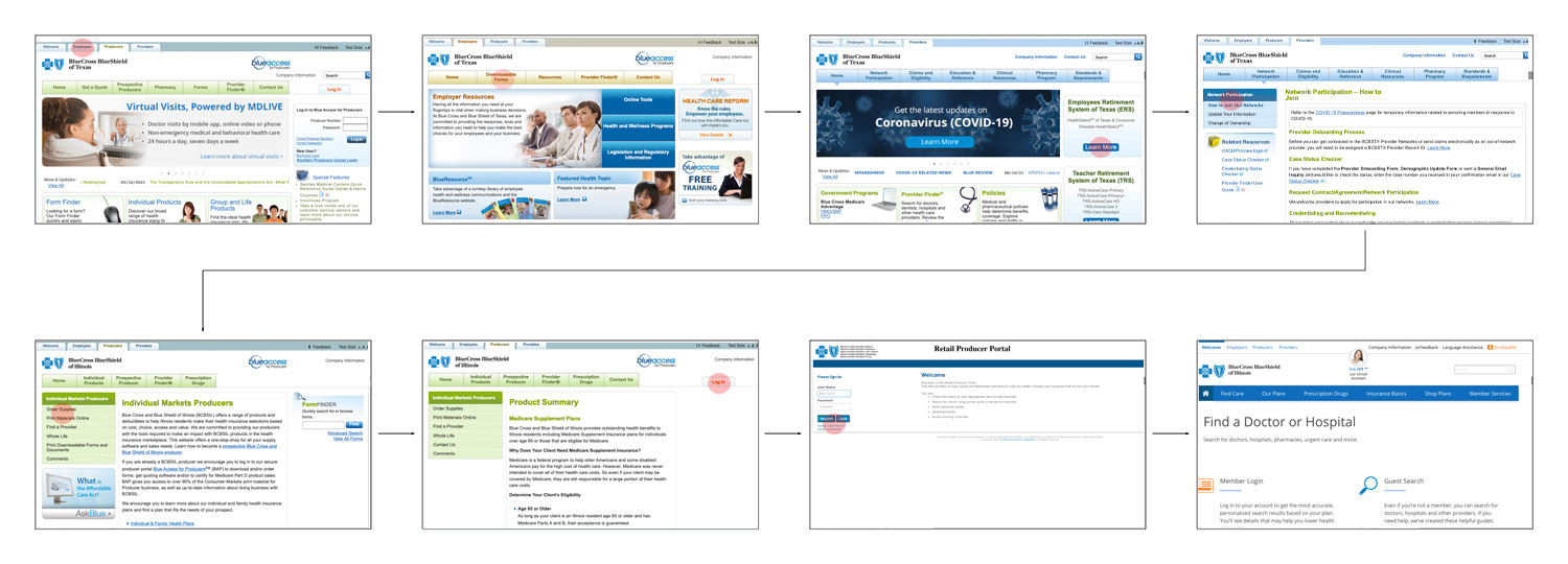
After identifying what areas of the existing site need improvement and communicating with insurance stakeholders for requirements, I conducted a heuristic evaluation of competitor websites. I developed user flows from competition workflows to determine how users were most likely to search for items.:
Research Existing Site Flow
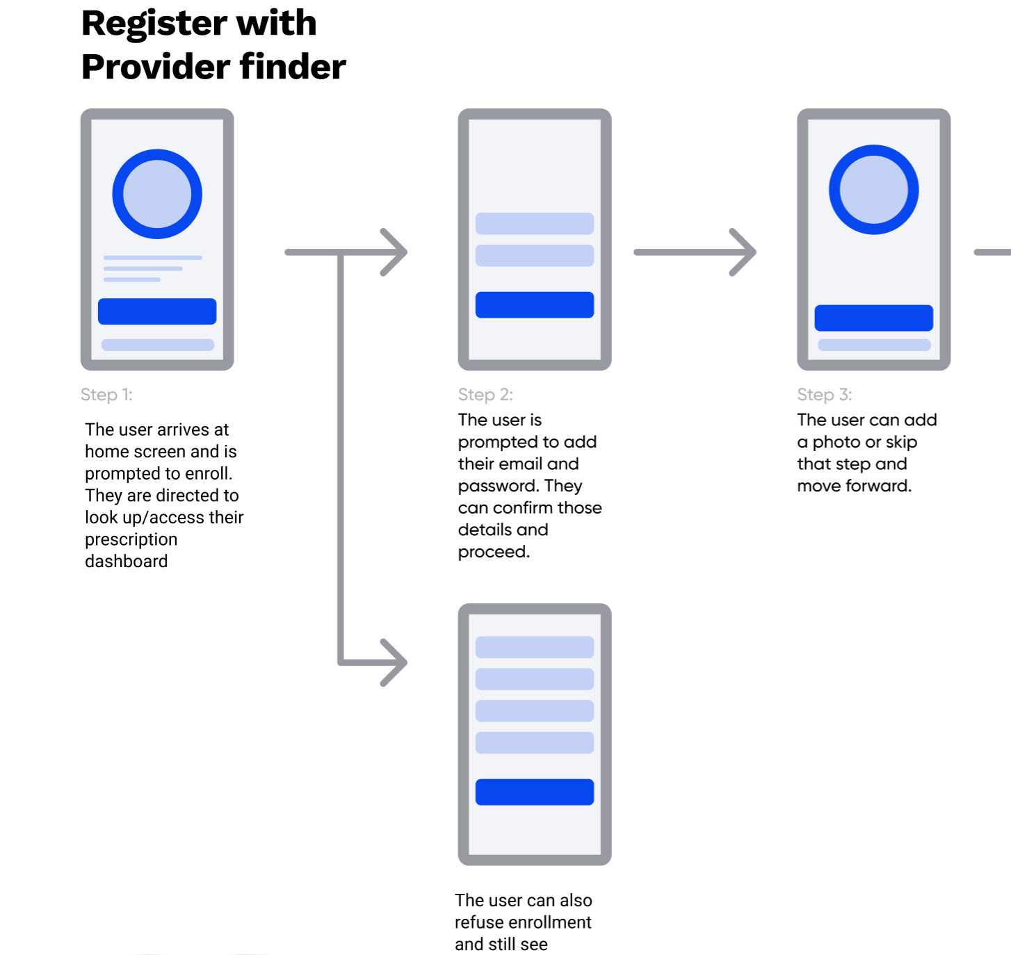
One of the essential phases is researching the existing site first. Before you can build a product, you need to understand its context for existence. For Blue Cross Blue Shield, this meant going through the site and creating maps of user workflows. The navigational process that a typical user would have to course to accomplish a required goal and simplify it.
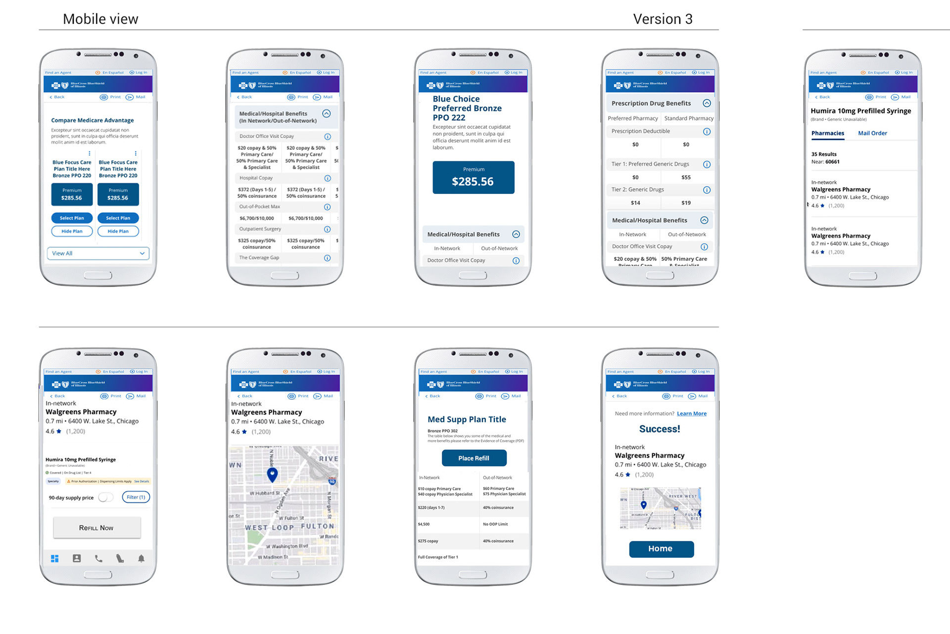
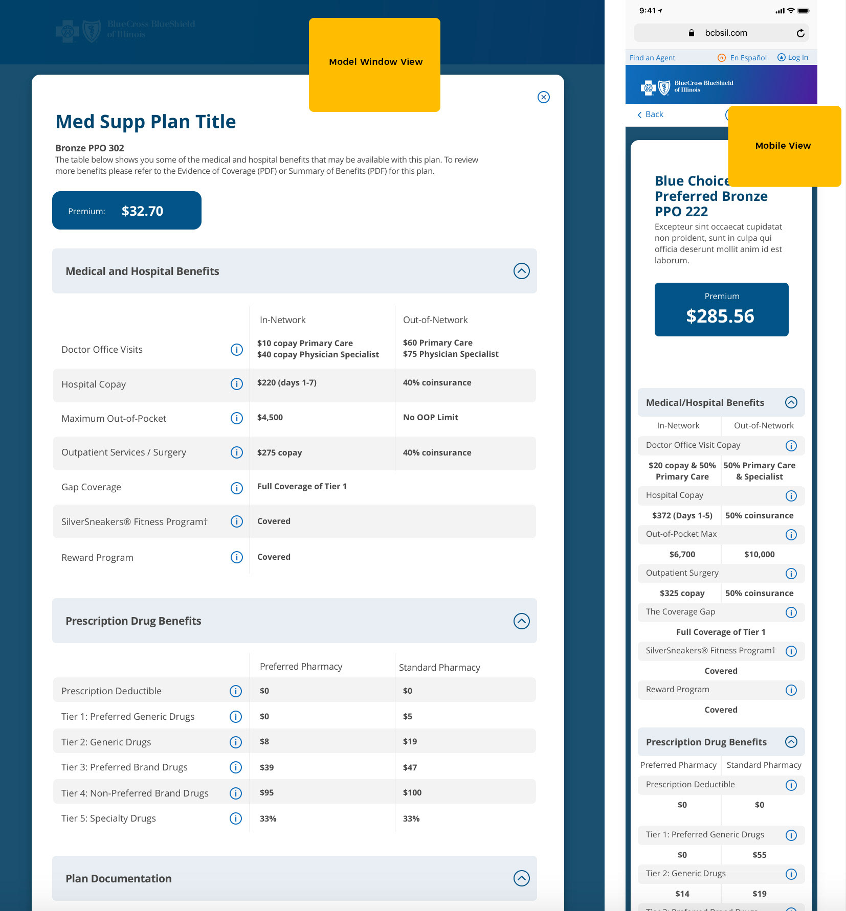
Mockups and Mobile Views
Working with Business Stakeholders, I examined the existing workflow of a typical user trying to find information from the site. I then created desktop and mobile workflows of the workflow with their goals in mind. Referencing search preferences (established from a 3rd party research group), I created User flows within requirements.
User Flows
Part of the process with Blue Cross Blue Sheild was reviewing existing workflows to determine where complex pain points and accessibility challenges were and how to streamline the existing process. Mapping out these workflows proved a communicative challenge requiring respect to HIPAA laws and sensitive information.
Responsive Mockups
In the design process, I would redesign existing pages according to the new style guidelines and redesign the information architecture for a responsive layout with an improved information hierarchy.
Summary
Working with a team of talented UX designers and communicative stakeholders, I believe that I helped Blue Cross Blue Shield's migration to a new site, a more seamless experience. I enjoyed working with a collaborative team and leadership that set a great example of tackling a complex and immense project into a manageable scope of work.